Games Workshop, a British manufacturer of fantasy and sci-fi miniature models, has long had a logo that reflected the pulpy action of the science-fiction and fantasy genre. However, as the genre and its associate media has matured, the logo feels flashy and disconnected from the company’s current IP.
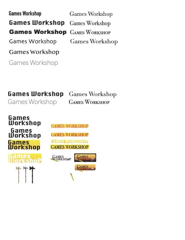
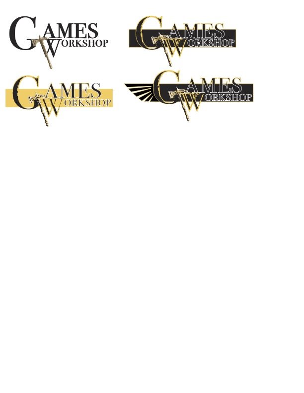
Ideation
The logo feels anchored in the pre-internet 1980s aesthetic of arcades, comics, and early roleplaying games.
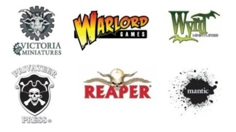
In contrast, GW’s competitors fall into two distinct categories of logos: a typeface referencing the style/genre to the miniatures they produce, or in allusion to a part of the hobby associated with plastic miniatures (assembly, painting, etc.)
However, the current GW logo does have an iconic look with its blocky, chiseled appearance giving it a greater weight and presence. Additionally the pyramid shape lets the logo stand out from far away, even before the letters can be read. The source lighting from the top left of the logo also adds a sense of heaviness/importance of the logo.
Given the qualities of both the current logo, and that of it’s competitors, a few design choices seem wise. Primarily, stay away from traditional serifed typeface. A majority of competitors, whose miniatures are based on historical-fantasy settings, are using serifed typefaces. Similarly, Warlord Games makes miniatures primarily inspired from the 1930s pulp genre fiction. Their logo remains reminiscent of the eye-catching comics and movie posters of the era.
Secondly, the incorporation of object source lighting (also a technique used in miniature painting) will contribute to the feeling of a heavier, more important logo.
Can I add shadow and deeper lighting to make it feel more 3D? Modernize the color scheme? Add a hammer instead of a letter?